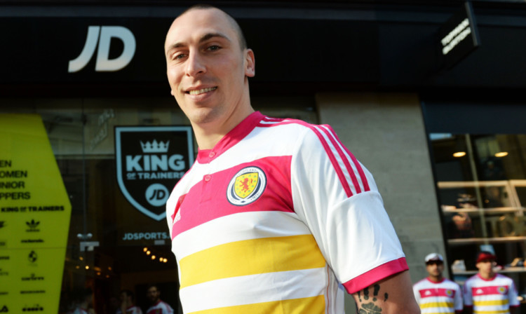
The new Scotland kit goes against the entire image of the nation.
Pulling on a Scotland shirt for the first time was the proudest moment of my career. But if I’d been pulling on the monstrosity that is our new away top, I’d have found it hard to feel any pride whatsoever.
For me, it’s the worst kit Scotland have EVER had. I just don’t understand how something like that can be allowed to happen. It goes against the entire image of the county.
Scotland has always traded on its passion, its strength and its determination. That’s what saw us through countless qualifying campaigns and into countless tournaments over so many years.
Throughout the 70s and 80s, we strode to four consecutive World Cup Finals wearing the traditional dark blue home shirt with a plain white, then a plain red, then a plain yellow change top.
This new rhubarb and custard number is supposed to take us through to Euro 2016 in France. It’s more likely to take us to Paris Fashion Week!
I was speaking to Alex McLeish about it on my radio show, and all we could do was laugh.
That’s not the sort of reaction a Scotland shirt should provoke. But in this case, there’s no alternative. It’s an absolute joke.
When I first saw the strip, I had to look at my calendar to check it wasn’t the first of April. Having done that, like many others, I was left to contemplate how on earth the decision was reached.
The official reasoning behind the colour scheme is to do with giving a nod to the racing colours of Lord Rosebery, whose patronage helped get the game off the ground in Scotland.
The national team have also worn the colours historically, so I understand the nod to tradition. But not all traditions are good things, and this is a prime example.
If Scotland are taking the field wearing what looks like a packet of sweets, how on Earth are we supposed to intimidate the opposition?
You can make the argument that a kit is a kit, and that the players wearing it will make the difference, and you’d be mostly right to do so.
But this is Scotland. It’s about more than the players on the field. It’s about everybody together, the whole country united in pride, battling against the odds, just as we’ve always done.
We can still do the business and qualify for France in two years time. I really believe that.
But in doing so, we don’t deserve to be made into a laughing stock by a daft, attention-seeking strip.
Enjoy the convenience of having The Sunday Post delivered as a digital ePaper straight to your smartphone, tablet or computer.
Subscribe for only £5.49 a month and enjoy all the benefits of the printed paper as a digital replica.
Subscribe