The annual release of the new Pantone Colour of the Year – Viva Magenta in 2023, incidentally – may set the tone for trends to come, but Cameron Prentice and Alex Longson find inspiration much closer to home.
Using photos taken around Scotland, including mountains and coastlines, forests and city streets, three years ago, the university friends started a project to meticulously study and sample the shades, creating unique and unusual colour palettes inspired by nature.
“We were on a trip through northern Skye, where we saw a really big beautiful mountain-scape with rich reds, greens and snow covered peaks,” explained Longson of the moment they decided to create Command+i, their design website and magazine, named after the Photoshop shortcut for sampling colours. “We said to each other, ‘Wow, that’s really beautiful, if only we could sample those colours for design projects’.
“We were headed to a remote cottage and the trip inadvertently turned into a three-day creative lock-in for the project. We talked about taking all the photographs from our hard drives, turning them into a booklet or a guide, and we settled on the idea of having a blend between a magazine, a coffee table book and almost one of those traditional geologists’ guidebooks.”
After choosing 25 photographs, the pair then sampled each one to create palettes of five new colours, and wrote descriptions about each location to inspire the practical application for the shades. Within four weeks, 1,000 copies of the first issue was printed and sold out. Although it would be easy to assume Scotland is filled with only greys, blues and greens, Longson, from Edinburgh, says our diverse landscape has a kaleidoscope of colours, which they explored more fully in the second issue of Command+i.
“We often say that Scotland serves as the absolute perfect experimentation for this concept,” he explained. “When it came to thinking about what we wanted to do as a second issue, a lot of people were telling us, ‘Oh, you should do places in England or France or Italy or Norway’, but we felt we hadn’t explored Scotland to its full extent.”

While the first issue utilised their own images, for issue two the pair reached out to friends in the photography community, who provided shots, from the cliffs of Dunnottar to the grass of the Pentlands.
Longson continued: “We tried to be a bit more deliberate about showcasing not just the depth and range of colours that you can get across Scotland, but locations as well. We looked at the map to decide where wasn’t as represented in the first issue, and realised we didn’t have anywhere in the Borders or the Pentlands or any real cityscapes, so that’s what we explored in the second issue. It was just trying to have more of a balanced approach.”
As well as including descriptions of the history, scenery and traditions of the area – not to mention a pinpoint latitude and longitude for those who want to visit – each entry also includes suggested uses for the related colour palette. For example, the colours found in wheat fields of Angus could be used for bedroom interior design, “balancing minimalism and refinement with freshness and vitality”.
“A lot of people love having it as a coffee table book, and some people, who are proud of Scotland, love just looking through the pages, even if they’re not technically in an artistic or design field,” said Longson, who also works as a brand designer.
“Most people just like and appreciate the aesthetic of the landscapes, especially as all Cameron’s photographs are beautiful, standalone images in their own right.
“However, we’ve had people design entire cafes around colour palettes. So, we would see a sale of the magazine happened somewhere down in Manchester, for example, and then they would get in touch asking if they could use one of the colours.
“We were also contacted by an executive producer for George Clark’s Amazing Spaces, who said they were looking for two colour experts to come help advise George on the colour of his caravan for the show’s 10th anniversary special. George found our magazine in the newsagents, and we went down to Lake District for a weekend to shoot with him. He’s been a really big advocate for us.”
With the majority of their sales abroad, Longson admits it’s nice to think there are small pieces of Scotland sitting on coffee tables around the world. He added: “Our most passionate readers are all in either Europe or Japan or the States. People who read it in Scotland see it more as a tool or a way of appreciating their home, whereas abroad they really feel that they are exploring Scotland through these landscapes.”
Lagangarbh, Glencoe
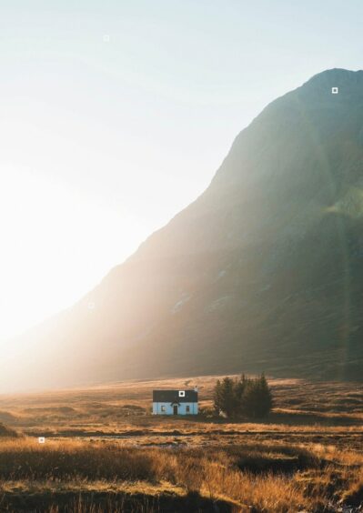

“This bright and crisp colour combination would work well for children’s interior design. Fun and uplifting, honeyed yellows such as amber encourage a feeling of joy. When thinking of the colour yellow, one can instinctively relate to the colour of the sun, memorising the warmth and life that comes with it as the season ebbs away. The tonal browns and burnished oranges contrast playfully with the blue.”
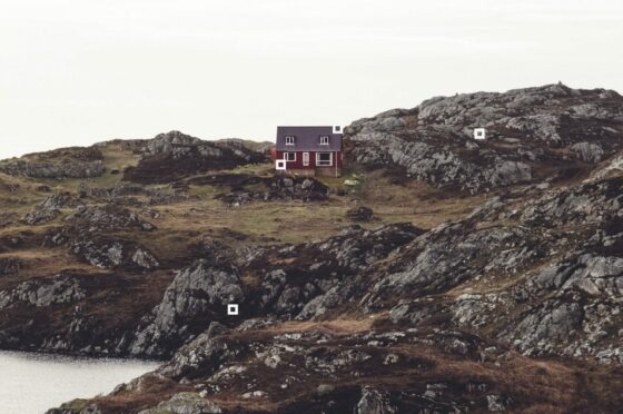
Sutherland
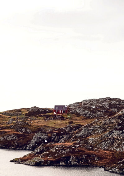

“These refined burgundy red bothy walls pair well with the secondary purple rooftop for a versatile and memorable colour scheme. These classic tones work well in fashion and art as well as graphic design. The richness provided by the ruby colour in this palette enhances the idea of luxury, giving a unique feel to the colour scheme when paired with the grittier more rustic grey tones. The reflected light of the sea envelopes the entire scape promoting a sense of security and containment.”
Black Cuillins, Skye
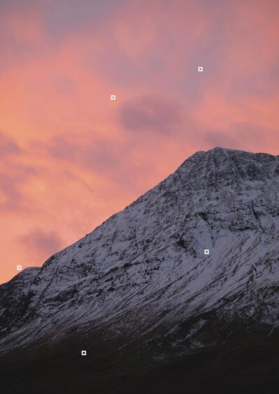

“The sunrise glow set against an early winter sky creates a blend of orange, pink and purple hues that harmonise with each other perfectly. Combining these three soft tones in a lattice or lateral design would showcase the best of this colour range. Peach, a prominent colour in this palette, brings about feelings of comfort. The soft-hued gradient of an early morning sunrise draws the viewer into a sense of wholesomeness and ease.”
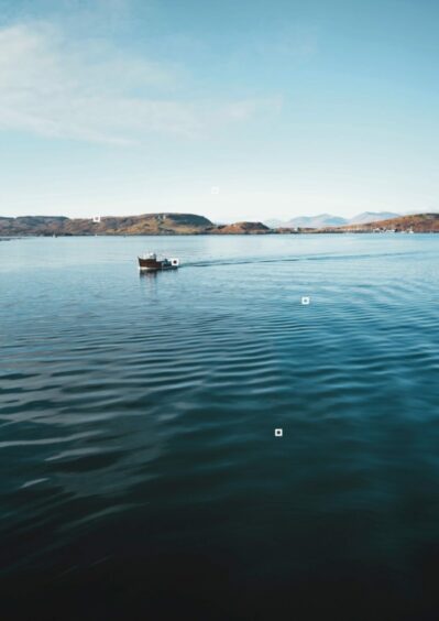
Oban, Argyle
 © SYSTEM
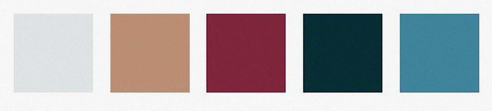
“The pairing of sea-green from the foreground water and red from the fishing boat centres this bold nautical colour combination. Such a wide range of chromas helps make Oban an ideal combination for a clothes’ collection. The complementary gem-like qualities captured in the Oban palette exude luxury and sophistication with beautiful precious tones of emerald, ruby, amber and sapphire.”
Enjoy the convenience of having The Sunday Post delivered as a digital ePaper straight to your smartphone, tablet or computer.
Subscribe for only £5.49 a month and enjoy all the benefits of the printed paper as a digital replica.
Subscribe